Product Video for Quick Commerce: Blinkit, Zepto and Instamart
A quick commerce product video is not a shortened Shopify video. The buyer is scanning a grid of small tiles, deciding in under two seconds, almost always on mobile, almost always with sound off, and often while doing something else. That makes first-frame legibility at thumbnail size the entire job. Pack recognition, quantity and one differentiator have to read before anything moves, because most shoppers never watch the movement at all.
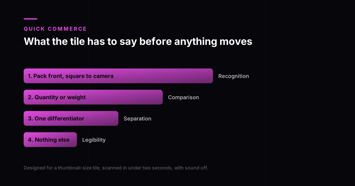
Why the quick commerce tile is a different brief
On a product page, the shopper has already chosen you. They clicked. The video is there to remove doubt before checkout, which is why product video lifts Shopify conversion the way it does.
On a quick commerce app, nobody has chosen you. They typed "atta" and got a grid. Your tile is competing with eleven others in the same glance, at a size where your beautiful pack shot is about forty pixels wide. The video is not removing doubt. It is winning a scan.
The scale problem is not specific to grocery apps. Baymard’s e-commerce usability research on showing products in scale found shoppers routinely misjudge product size from images that do not provide a reference, and a thumbnail strips away even more of the cues a full product page would carry. On a tile, quantity and weight are doing the work an entire product page normally does.
Assume the phone, too. Quick commerce barely exists off mobile, and StatCounter’s India platform share puts most of the country’s browsing there anyway. There is no desktop version of this decision to fall back on.
What has to be readable before anything moves
| Element | Why it comes first | Common mistake |
|---|---|---|
| Pack front, square to camera | Recognition is the whole decision | A three-quarter hero angle that hides the label |
| Quantity or weight | Price comparison is instant and unforgiving | Leaving it to the text field below the tile |
| One differentiator | The only thing separating you from the tile beside you | Three differentiators, so none of them read |
| Brand mark | Repeat purchase is the whole margin in this channel | A logo sized for desktop |
| Nothing else | Every extra element costs legibility | Lifestyle context at thumbnail scale |
Pacing for a two-second decision
Conventional advice for short-form is to open with a hook and pay it off. That advice comes from feed video, where the viewer is passive and open to being interested. A grocery grid is neither. The shopper has an intent already formed and is looking for the fastest match to it.
- Frame one is the finished, recognisable product. Not a build-up to it.
- The first movement should confirm scale, not create intrigue. A hand entering frame does more work here than a camera move.
- Keep the whole thing under eight seconds, and make it loop cleanly, because a loop point that jumps reads as a broken tile.
- Burn any claim into the frame as text. Sound is off, and it will stay off.
- Avoid a hard cut in the first second. At tile size a cut reads as a glitch rather than as editing.
The sound assumption deserves one more note, because it is an accessibility requirement as well as a practical one. Captions are required at Level A under WCAG, and on a surface that autoplays silently in a grid they are simply how the video communicates at all.
What changes per platform
Treat platform specifications as a moving target and check the live seller documentation before every delivery, because these apps revise their creative requirements more often than marketplaces do. What does not change is the constraint underneath: small tile, no sound, fast scan.
The practical approach is to master one video at the strictest specification you have, then cut down rather than up. A tile-first master survives being re-cropped for a Shopify page. A Shopify master rarely survives being cropped for a tile, because the composition assumed a screen twenty times bigger.
How this connects to the rest of your catalogue
Quick commerce is usually a subset of a wider catalogue problem, and it is the subset with the shortest video and the highest volume of SKUs. That combination is exactly where a photo-driven pipeline earns its keep, since a good still can carry several seconds of usable motion and most grocery SKUs already have one.
It also changes the maths on what to produce first. A hero SKU deserves the full treatment. A long tail of variants needs a repeatable template that stays legible at tile size, which is a different job from a listing video built for the Amazon detail page and a different job again from a paid social ad.
Frequently asked questions
Can I use my Shopify product video on Blinkit or Zepto?
Usually not without a re-edit. A Shopify video is paced for someone who has already clicked through to your page and is deciding whether to buy. A quick commerce tile is competing for a two-second scan in a grid at thumbnail size, so the composition, pacing and text sizing all have to change even when the footage does not.
How long should a quick commerce product video be?
Short enough that the loop is the experience rather than the runtime. Under eight seconds is a sensible ceiling, and the video should loop cleanly, because most shoppers will see the loop point before they see the end.
Does the video need sound?
Assume it will never be heard. These apps are used in transit and at work, and autoplay in a grid is silent by default. Any claim that matters has to be burned into the frame as text.
What should the first frame show?
The finished product, square to camera, with quantity or weight legible and one differentiator. Recognition is the decision being made, so the first frame has to answer it before anything moves. Test it by shrinking the frame to fingernail size on a phone.
Which SKUs should get a video first?
The ones where you lose the scan rather than the ones where you lose the sale. That usually means high-competition categories with visually similar packs, where the tile is doing the differentiating. A long tail of variants is better served by a repeatable legible template than by bespoke films.