What Makes an AI Commercial Look Premium (Not Cheap)
Premium comes from pacing, a real colour grade, built sound design, and shots of varied length used with intent. Cheap AI video is uniformly lit, uniformly paced and uncut. The model is rarely the reason: almost every tell that makes generated footage look cheap is a decision nobody made rather than a limitation of the tool.
Most AI video looks cheap. People blame the tool. The tool is almost never the reason. You can see this clearly whenever two people run the same model on the same brief and get results that are not remotely comparable in quality. If the model were the constraint, that would not happen.
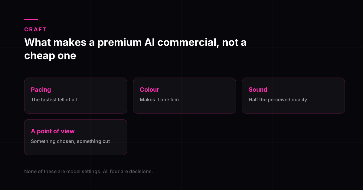
Premium is a set of directing choices, not a setting you switch on. Here is what those choices actually are.
Pacing, the fastest tell in a premium AI commercial
There is a mechanical reason this happens, and knowing it makes the fix obvious. Most current models generate in clips of roughly 5 to 15 seconds, with the longer-form models topping out around 18 to 20. That is the unit the tool hands you.
Use those units whole and the film inherits the generator’s rhythm rather than one you chose. Every shot runs the same duration because every generation was the same duration, and the eye notices immediately even when the viewer cannot say why. Real films breathe unevenly. A held wide shot, then three quick cuts, then a long slow push. The rhythm carries meaning.
The fix costs nothing but attention. Cut generated clips down rather than using them whole. A four second generation might contribute one useful second. Using all four because you paid for them is how films end up feeling flat.
What to look for in your own edit
- If you can tap along to your cuts, the pacing is too regular.
- Vary shot length by intent, not by accident. A held shot signals importance, a fast cut signals energy.
- Cut on movement where you can. A cut in the middle of an action hides the seam between two generations.
Colour: making it one film
Raw generated output rarely matches shot to shot. One clip is cooler, another is more contrasted, a third has a slightly different skin tone. Individually none of them look wrong. Cut together, the film looks assembled from parts, which is exactly what cheap means visually.
A grade does two jobs. First it matches the shots to each other so the film reads as one piece. Second it gives the film a mood that supports what the film is about. Neither of those is a filter. A preset applied uniformly across mismatched footage makes the mismatch more obvious, not less.
Sound: half the film, a tenth of the attention
Sound is where the gap between premium and cheap is widest, and where the least effort usually goes. A stock music bed laid over the whole film with no other audio is the default, and it is instantly recognisable.
Built sound design means the film has the sounds the pictures imply. Footsteps, fabric, a lid closing, room tone that changes when the location changes. None of it is consciously noticed by a viewer. All of it is noticed when absent, as a vague sense that the film is not quite real.
- Give the film room tone. Silence between music cues sounds broken; a room sounding like a room does not.
- Let the music stop. A bed running unbroken from first frame to last flattens everything, because nothing can build if nothing ever rests.
- Sync at least a few sounds precisely to picture. Two or three well-placed effects do more than a library dumped underneath.
- Mix the voice above the music, then check it on a phone speaker, which is where most of the audience will hear it.
A point of view
This is the one that cannot be bought, borrowed or generated. Before anything gets made, somebody has to decide what the film is about. Not what it shows, what it is about. A film about reassurance is cut differently from a film about excitement even when both contain the same product on the same table.
Films without a point of view are recognisable because every shot is equally weighted. Nothing is emphasised, because nothing was judged more important than anything else. That is what a generated slideshow really is: a sequence of competent images that nobody made a decision about.
What the model is actually responsible for
Being fair to the tools: some things genuinely are model limitations, and they are consistent enough across the leading models in 2026 to plan around.
| Still unreliable | What goes wrong |
|---|---|
| Hands in close-up | Anatomy drifts, especially over longer clips |
| Text in frame | Signs, labels and packaging come out garbled |
| Liquids | Pouring and splashing produce artefacts |
| Cloth in motion | Fabric behaviour looks wrong under movement |
| Character consistency across shots | The same person does not stay the same person |
| Close multi-person contact | Handshakes and crowds lose coherence |
Those are real, and the answer is to direct around them rather than to fight them. Every one has a shot-selection solution: keep hands mid-shot rather than macro, composite real packaging text rather than generating it, cut away at the moment a liquid pours, and build scenes that do not require two people touching.
That is a shot selection problem, and it is solved the same way a director solves any constraint: shoot what works, cut away from what does not. The difference between a premium AI commercial and a cheap one is almost never the model on the invoice. It is whether anyone made choices. More on where that fits commercially in AI actors in commercials and how to choose an AI video agency.
Where the budget actually goes on a premium AI commercial
The assumption behind most cheap AI video is that generation is the expensive part, so a cheaper generator means a cheaper film. The split says otherwise, and it explains why two projects using identical models produce different results.
- Concept, script, direction
- 30 to 40%
- Edit, pacing, colour, sound
- 25 to 35%
- Generation and shot selection
- 20 to 30%
- Versions and delivery
- 10 to 15%
Our own split across recent commercial projects. Generation is the smallest expensive-looking line, and the only one a subscription replaces.
Everything the previous sections described as the difference between premium and cheap, meaning pacing, grade, sound and a point of view, sits in the top two rows. That is roughly two thirds of the work, and none of it is a model setting. It is also consistent with what drives advertising outcomes generally: Nielsen attributes about half of advertising-driven sales effect to the creative itself, as much as reach, targeting, recency and context combined.
What to brief if premium is the requirement
- One idea the film is about, written in a sentence. If it needs a paragraph, the film will look like a list.
- A reference for pace, not just for look. Two films with identical grading can feel a decade apart on cutting rhythm alone.
- A decision about sound before production, not after. Licensed bed, composed score or designed effects are three different budgets.
- The shots you will not need. Constraint is what produces a point of view; a brief that permits everything produces footage.
- Which single frame has to work as a still, because that is what runs as the thumbnail and the paid placement.
Briefed that way, the model choice becomes an implementation detail rather than the project. Brand film versus product ad covers which of the two you are actually commissioning, and our AI commercial production works from a locked concept before anything is generated.
Why none of this is a model setting
Before any of it, decide which shots the film genuinely rests on, because some shots still need a camera. Every one of those decisions, pacing, grade, sound and a point of view, is made by a person, and none of it appears in a generator's interface. That is why the same tools produce a premium film in one studio and a slideshow in another, and why the tooling is the least informative thing on a quote. If a supplier's answer to "why will this look good" is the name of a model, they have answered a different question.
What the neuroscience says about these four
Three of the four elements above show up in measurement rather than taste. Thinkbox's neuro study of 150 TV ads found that music driving the action produced significantly more peaks of memory than background music or none, that integrating brand colour lifted emotional response by around 9 percent, and that weaving the product into a narrative rather than presenting it generated roughly 1.4 times more peaks of strong brain response. Pacing, colour and sound are not finishing touches applied at the end; they are where the response is manufactured.
Frequently asked questions
Does using a better AI model make the video look premium?
It raises the ceiling and does not raise the floor. A stronger model gives you cleaner footage to work with, which helps. It does not decide pacing, it does not grade the film, it does not design the sound, and it does not have a point of view about what the film is for. Those four things are what a viewer is actually responding to when they call something premium or cheap.
Why does my AI video look like a slideshow?
Almost always uniform shot length. If every clip runs the same duration, the film has no rhythm, and the eye reads a rhythm-free sequence of images as a slideshow. Cut your generations down to their useful part rather than using them whole, and vary the length deliberately. This one change fixes more perceived-quality problems than any other.
How much does sound design matter compared to the visuals?
More than most people expect. Viewers rarely notice good sound and almost always sense bad sound, usually reporting it as the video looking cheap rather than sounding wrong. If you have limited time and budget left at the end of a project, spending it on sound generally returns more perceived quality than spending it on another round of generation.
Can AI commercials look as good as traditionally shot ones?
For many kinds of film, yes, and for some kinds, not yet. Product-led films, atmospheric brand pieces and stylised work can reach a genuinely high standard. Films that depend on a long unbroken performance from a consistent human character remain harder. The honest approach is to pick projects that play to what the method does well rather than asking it to imitate a shoot exactly.
What actually makes an AI commercial look cheap?
Four things, and the model is rarely one of them. Uniform shot lengths, which make the film feel like a slideshow rather than an edit. No colour grade, so each generated clip carries its own slightly different lighting and the film never reads as one piece. A stock music bed chosen after the edit rather than designed with it. And no point of view: nothing chosen, nothing left out, nothing the film is actually about. All four are decisions rather than capabilities, which is why two studios using identical tools produce different results.
How long should a premium AI commercial be?
Twenty to sixty seconds for most brand and product work, and the shorter end more often than people expect. Length is set by how many ideas the film carries rather than by budget: one idea told well fills twenty seconds and collapses if stretched to ninety. A longer runtime is justified when the product genuinely has stages to show, not when there is more to say about it. If the cut feels slow, the usual cause is too few ideas rather than too many seconds.